Check out our highlight in the "Fab Finds" section of Austin Home Magazine Winter 2013!
(Double click the photo to enlarge)
Check out our highlight in the "Fab Finds" section of Austin Home Magazine Winter 2013!
(Double click the photo to enlarge)
Paula Ables Interiors was featured in the ASID Design Guide as winners of the 27th Annual Design Excellence Award for Residential: Contemporary Large >5000 sf and Residential: Remodel Small <3500 sf! Click on the thumbnails below to see the articles.
Paula Ables Interiors work on the Spanish Oaks house was featured in the Winter 2012 issue of Austin Home! Click on the thumbnail to see the article. (Double click the photo to enlarge)
Houzz featured a patio designed by Paula Ables Interiors in a recent blog titled "Great Cover Ups". The patio:
[xyz-ihs snippet="HouzzCoverup"]
The full blog entry with slideshow:
[xyz-ihs snippet="Houzz"]
The 2012 Legacy of Design awards is a state-wide design competition sponsored by Design Guide and American Society of Interior Designers.
Paula Ables Interiors placed:
2nd Place- Residential Contemporary (Large)
2012 ASID Design Excellence Awards
1st Place Contemporary Residence Large-over 3500 sq ft
1st place Remodel Small-under 3500 sq ft
Come check out the list of winners for the 2012 Design Excellence awards...Who are those cool cats in the second photo??!!
 On many occasions I have walked into a bedroom with a new lamp in hand only to find the outlet is directly in the center of the wall behind the headboard. How are you supposed to plug things into this outlet? It isn’t an issue if you are Elastigirl and can stretch your arm into that awkward position to get under and over the headboard rail or you can stretch from the side to reach it. If the outlet is centered behind a king-size bed, good luck plugging something in without moving the bed.
I often think that the people designing and building houses are only taking into consideration the building code requirements and costs per outlet but not how people actually live in and use the space they are creating. Wouldn't it be nice if outlets were conveniently placed in the spaces you want to access them? In most cases, this is a simple and inexpensive project that could help improve your quality of life in the spaces you are in the most.
When deciding the locations of your outlets here are a few suggestions:
 For floor outlets in an existing living space, putting an outlet in the slab is not so easy. Just as with new construction, you need a plan for your furniture placement, then place the outlets to each side of the sofa for easy access to lamps on end tables. If your furniture is in the middle of the room, use wire/cable cover that runs along the baseboard until you can turn a 90 degree angle and head under a rug. Tape the wire down to the floor to keep it in place and find a floor wire cover that is close to the color of your tile/hardwood so it will virtually disappear.
You don't have to live with the meager selection of outlets that came with your house. They're inexpensive and easy to install, even in a home that's already built. Stop dealing with the hard-to-reach plugs and the tangle of wires and power strips - make your outlets work for you.
Click Here to See other Blog Posts by Paula Ables Interiors
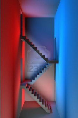
Rumor has it, color change causes mood change. How can this be you might ask? Here are a few examples:

Yes, these are all examples in Commercial spaces. This same line of thinking can be applied when selecting a color for your home as well.
We all know whites are crisp and clean and if you are not careful can go institutional in the
blink of an eye. Neutrals such as taupe and tan are great for staple colors in hallways and secondary rooms. They help to tie your rooms together as a cohesive unit. But how many times have you walked into a home that felt like it was a “Tribute to Tan”? Let’s add some color to your room to see if we can liven things up.
We will start with primary colors:
 |
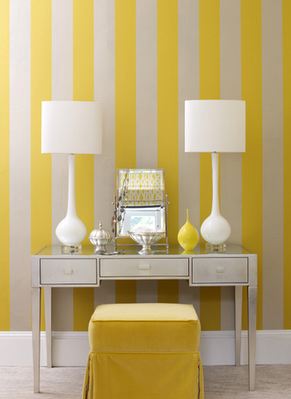
Blue: Light blues are relaxing, calming and soothing. The color makes you think of water and a beautiful clear sky. In your home it is a great color to use in bedrooms and bathrooms. Yellow: The color of sunshine. Whether you are using a soft subtle or a bright in your face tone, yellow makes you happy. In your home it is a great color to use in breakfast rooms and play rooms. It wakes you up and gets you ready for the day. |
 |
Red: Want to feel excited and energized? Red is your color! Red is great for Game rooms and playrooms where high energy games and brain stimulating activities are a guarantee. Other great areas to use red for a pop of color are Foyer’s, Living and Dining rooms. Whether used as a whole room or an accent wall red will stimulate your heart. (Best to avoid bedrooms and bathrooms as some tones do cause agitation and could undermine the serenity you often seek in these rooms.)
Next we will talk about the secondary colors:
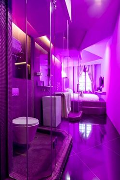
 Purple: What a history this color has…purple has always been associated with royalty and luxury. It is wonderful when used as an accent in paint or fabric. When using the lighter tones, purple can give the same feelings of relaxation and serenity as a light blue. As the darker tones have more of a flair for the dramatic, when I think purple, I think VELVET; Soft, luxurious and a wow factor in any room.
Orange: I mentioned above that orange in a restaurant setting is supposed to make you think inexpensive. It also has other great emotional effects. Like red, various tones of Orange are energizing and exciting. It is great when used in an exercise room and breakfast room.
Green: When I think of Zen and peace, I think of green. It is a wonderful mix of the serenity of blue and the cheerfulness of yellow. What more could you ask for in this world? Green is great in any room of the house. It provides interest and energy, yet comfort and relaxation. Rumor has it that green also helps with fertility…an interesting thought. (I would have said red)
Now, go forth and paint or accessorize accordingly! Love the spaces you are in. The cheapest change you can make in your home is painting an accent wall. I promise once it is done you will wonder why you waited so long to do it.
Click Here to See other Blog Posts by Paula Ables Interiors